
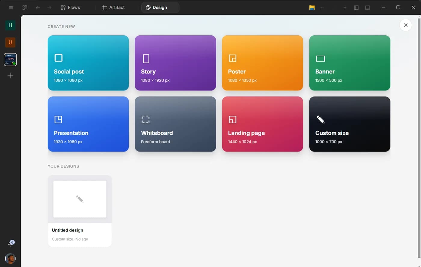
“Make a design” is not a complete instruction. A social graphic, a presentation, a whiteboard and a website have different structures, review methods and export needs.
The Design app gives those outputs distinct surfaces inside the desktop. You can generate a starting point with AI or build directly, then continue editing instead of treating the first render as the finished work.
Choose the output type first
Graphics use a fixed or custom canvas. They are appropriate for posters, cards, banners and other visual assets whose message must work in one frame.
Presentations use a sequence of slides with layouts, speaker notes, transitions and presenter behavior. The argument across slides matters as much as any individual frame.
Whiteboards are spatial thinking surfaces. They are useful for mapping concepts, organizing evidence and exploring a system before the structure becomes a polished deliverable.
Websites can contain multiple pages and export as HTML. They require navigation, content hierarchy and responsive behavior rather than a single static composition.
Selecting the surface before prompting gives the assistant the right design grammar.
Brief the job, not the decoration
A useful design brief includes the audience, the decision or action, the required content, the output size or format and the constraints that cannot change.
For a graphic, name the one message a viewer should understand. For a presentation, name the audience’s starting belief and the decision the final slide should support. For a whiteboard, name the relationships that must become visible. For a website, list the pages and the action each page should make easier.
Avoid style-only prompts such as “make it modern.” Give the assistant a reason for every visual choice. “A calm operations dashboard for a team reviewing exceptions” contains more usable direction than a list of fashionable effects.
Generate a starting point, then edit
AI generation is most useful for overcoming the blank canvas and proposing a structure. Treat the first result as a draft. Inspect hierarchy, spacing, contrast, repeated components and content accuracy.
Edit directly where the problem lives. Change the headline rather than regenerating the whole graphic. Reorder two slides rather than requesting a new deck. Move related whiteboard nodes together. Correct the navigation and section order without discarding the website’s working parts.
This keeps decisions stable and makes iteration faster. Repeated full regeneration can solve one issue while reintroducing three that were already fixed.
Graphics need a message hierarchy
Start with the canvas size and destination. A square social post, a wide banner and a printable poster cannot share the same composition unchanged.
Limit the primary message. Supporting text should explain or qualify it, not compete with it. Use brand colors and typography consistently, and check contrast at the final viewing size.
Before exporting, remove placeholder content, inspect the edges for clipping and confirm that logos and images are assets you have the right to publish.
Presentations need an argument
A deck is not a document broken into rectangles. Give each slide one job and make the sequence visible: context, problem, evidence, approach, decision and next step.
Use speaker notes for what should be said, not for paragraphs that were squeezed off the slide. Transitions and motion should clarify sequence or focus. If motion adds no meaning, leave it out.
Review the deck in presenter mode and at the distance an audience will see it. A slide that looks elegant while editing can be unreadable in a room.
Whiteboards should expose relationships
Whiteboards are strongest before certainty. Use them to group sources, map a process, compare approaches or discover missing dependencies.
Ask the assistant to label connectors and clusters rather than producing a cloud of attractive boxes. A person should be able to explain why two items are near each other and what an arrow means.
Once the structure settles, move the result into Artifact for a written brief, into a presentation for a decision meeting or into Developer when it becomes an implementation plan.
Websites need content architecture
For a multi-page website, begin with the page list and navigation. Identify the primary action, supporting proof and questions each page must answer. Then decide which elements repeat as a system.
Preview the result at multiple widths. Check links, focus order, text contrast and whether the primary action remains clear without relying only on animation. Exported HTML should be inspected as a working site, not only as a canvas screenshot.
Do not use Design to imply that every generated page is production-ready. Real deployment may require performance, analytics, forms, backend integration and security work outside the visual surface.
Keep the project connected
Design projects persist with the current workspace. This makes it possible to use the same source material across a document, deck and website without re-explaining the entire subject.
Keep approved copy and assets in identifiable project locations. If the assistant creates variants, name what changed: audience, format or message. “Version 7” is not a design decision.
When the result includes factual claims, use the project sources and verify them before export. A beautiful unsupported number is still wrong.
Ask Upfyn
Choose the correct Design surface for this outcome. Write a brief covering audience, action, required content, format and constraints. Generate only a starting structure, then give me a review checklist before making further visual changes.